Slide Design Principles

01
OKC Slide Design Principles
This document is a brief orientation to the principles, assets, elements and modules that inform the design of digital presentations within Basketball Operations.
Templates that include these assets exist on two platforms: PowerPoint and Slides.com. Each platform has merits and considerations, but these guidelines apply broadly to both.
OVERVIEW
Presentation Guidelines
Powerpoint

- Universal and familiar tool
- Easy to build and share
- Limited motion capability
- Local editing and sharing
Slides.com

- More dynamic and interactive presentation option
- Slight learning curve
- Web-based editing and sharing
- Advanced motion adds complexity
02
OKC Slide Design Principles
OVERVIEW
Principles and Best Practices
04
Motion should add meaning
Use animation sparingly.
Avoid unnecessary transitions, builds or animation effects unless they enhance comprehension.
Examples of using motion intentionally to add clarity might include: breaking down component parts, zooming out to put data in context, expanding to emphasize a specific point, or building out a framework.
03
Show more, write less
It’s a slide show, not a slide tell.
Presentations are visual, multi-media formats, not documents. Resist the temptation to tell the whole story in text.
All writing should be short and sharp, succinct takeaways, snippets rather than sentences.
Take advantage of imagery, video, audio, and data visualization to enhance and enrich the delivery.
02
Just enough is enough
Resist over-crowding or filling space.
Aim for one key takeaway for your audience per-slide.
Supporting text, data or imagery should only reinforce, illustrate or strengthen the takeaway.
Don’t feel the need to ‘fill up’ slides. Image-only, data-only, headline-only moments can be powerful.
01
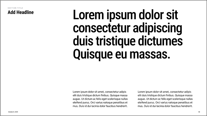
Consistency, contrast and hieratchy
Lead the eye with intention.
Adhere to consistent layouts, elements and styles to keep the focus on content.
Create contrast and hierarchy by controlling scale, color and white space, to direct attention and guide read-order.
Avoid competing typographic styles and unnecessarily complex or noisy layouts.
03
OKC Slide Design Principles
OVERVIEW
Principles and Best Practices
01
Consistency, contrast and hierarchy


Do use type styles to create clear hierarchy
Don’t make all type a similar size
Lead the eye with intention.
Adhere to consistent layouts, elements and styles to keep the focus on content.
Create contrast and hierarchy by controlling scale, color and white space, to direct attention and guide read-order.
Avoid competing typographic styles and unnecessarily complex or noisy layouts.
04
OKC Slide Design Principles
OVERVIEW
Principles and Best Practices
02
Just enough is enough
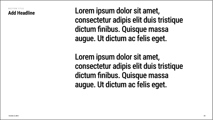
Do create pages that are focused/singular
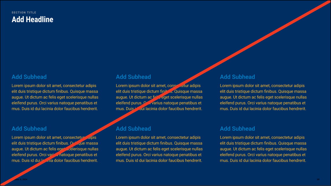
Don’t create pages that are overly complex
Resist over-crowding or filling space.
Aim for one key takeaway per-slide.
Supporting text, data or imagery should only reinforce, illustrate or strengthen the takeaway.
Don’t feel the need to ‘fill up’ slides. Image-only, data-only, headline-only moments can be powerful.
05
OKC Slide Design Principles
OVERVIEW
Principles and Best Practices
03
Show more write less
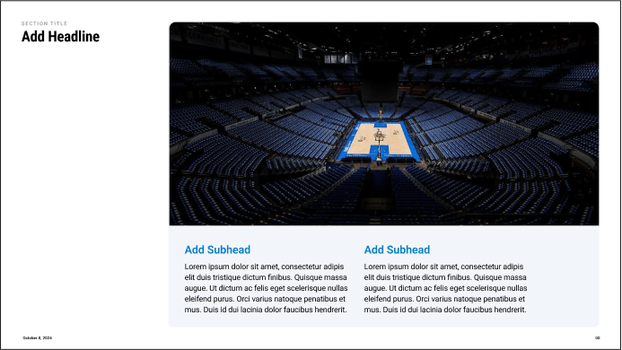
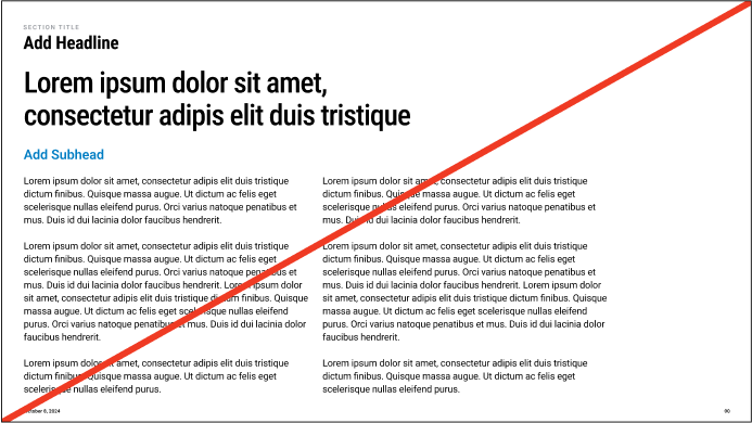
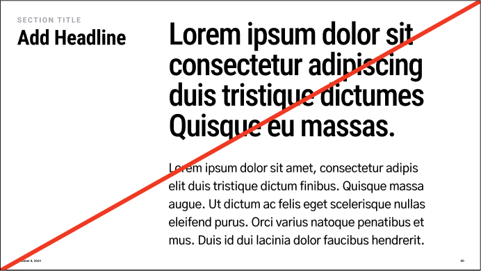
Do lead with images that support points
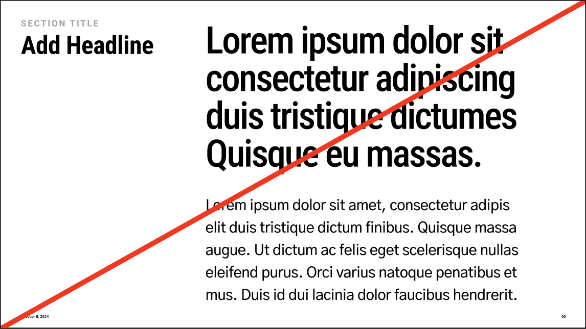
Don’t create pages with long form copy
It’s a slide show, not a slide tell.
Presentations are visual, multi-media formats, not documents. Resist the temptation to tell the whole story in text.
All writing should be short and sharp, succinct takeaways, snippets rather than sentences.
Take advantage of visualizations to enhance and enrich the delivery.
06
OKC Slide Design Principles
OVERVIEW
Principles and Best Practices
04
Motion should add meaning
Do use transitions that help illustrate points or the overarching narrative
Don’t use animation in decorative ways
Use animation sparingly.
Avoid unnecessary transitions, builds or animation effects unless they enhance comprehension.
Examples of using motion intentionally to add clarity might include: breaking down component parts, zooming out to put data in context, expanding to emphasize a specific point, or building out a framework.
Typography
01
07
OKC Slide Design Principles
08
OKC Slide Design Principles
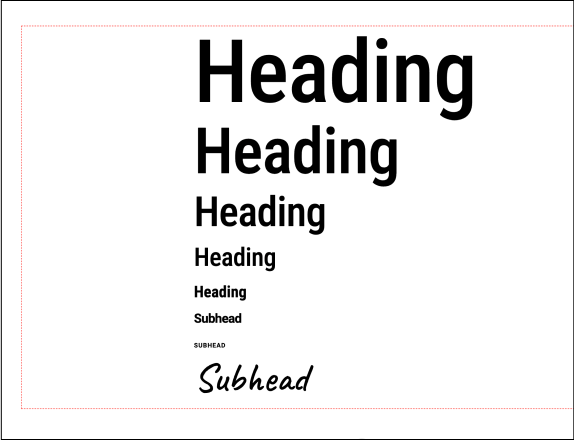
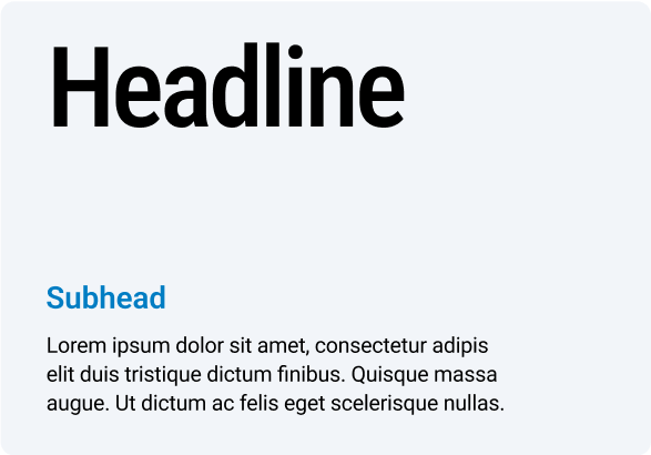
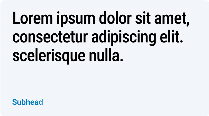
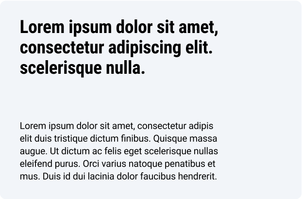
The following type hierarchy shows the relative size relationships between each type class.
We lead with Roboto Condensed for a bold and confident voice. It is supported by Roboto standard for more legibility at smaller sizes.
As a general principle, larger type sizes call for tighter tracking and leading values, and smaller type sizes need more breathing room for legibility.
Typography
Type Waterfall
The following type hierarchy shows the relative size relationships between each type class.
We lead with Roboto Condensed for a bold and confident voice. It is supported by Roboto standard for more legibility at smaller sizes.
As a general principle, larger type sizes call for tighter tracking and leading values, and smaller type sizes need more breathing room for legibility.
Roboto Condensed Medium
Headline
Roboto Condensed Medium
Headline
Roboto Condensed Medium
Headline
Roboto Condensed Medium
Headline
Roboto Condensed Bold
Headline
Roboto Semibold
Subhead
Roboto Semibold
Roboto Regular
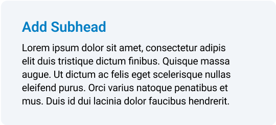
Lorem ipsum dolor sit amet, consectetur adipis
Roboto Regular
Lorem ipsum dolor sit amet, consectetur adipis elit duis tristique dictum finibus. Quisque massa
09
OKC Slide Design Principles
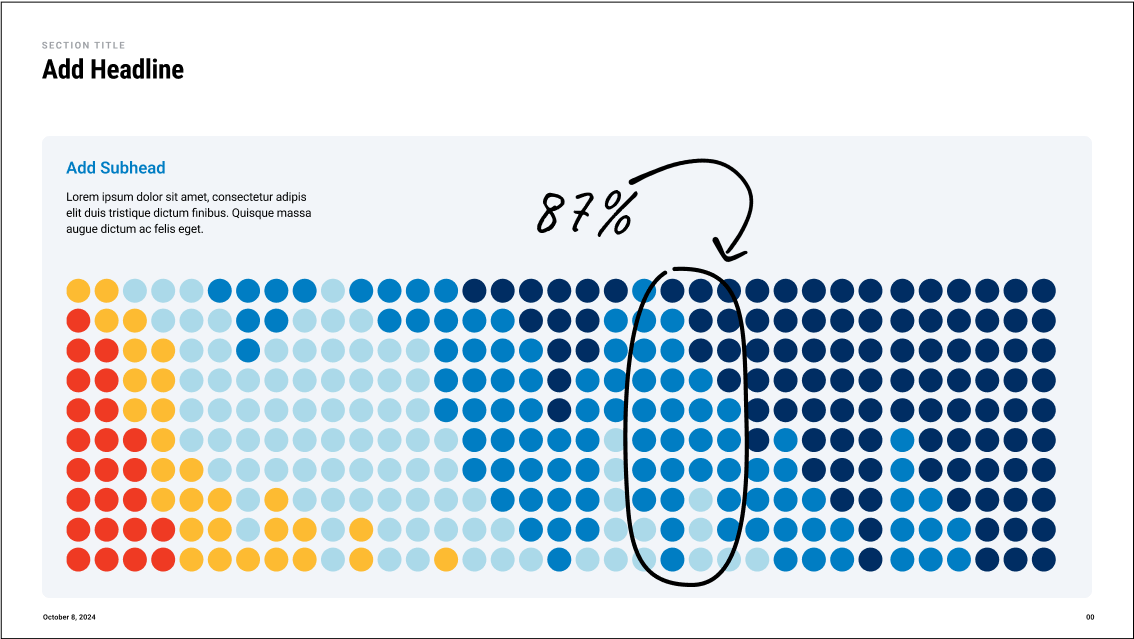
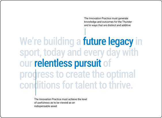
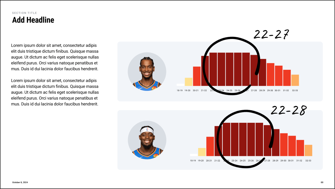
We can use Caveat to draw emphasis certain data points or narrative overlays. This handwritten typeface contrasts Roboto and relates to the language of the sport.
Additionally hand drawn elements like arrows and circles can be used to draw attention specific areas of a page.
Secondary Type
Typography

10
OKC Slide Design Principles
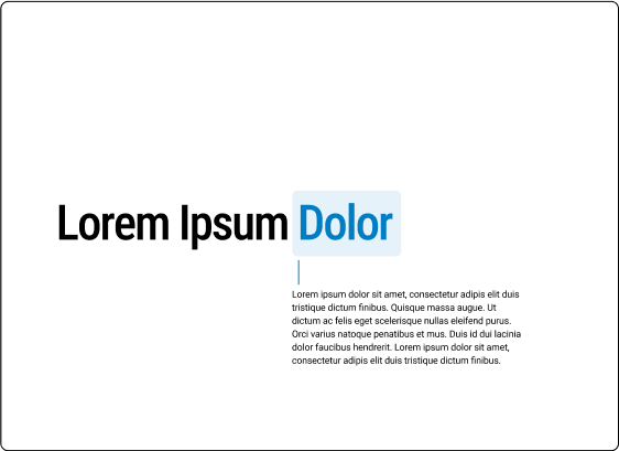
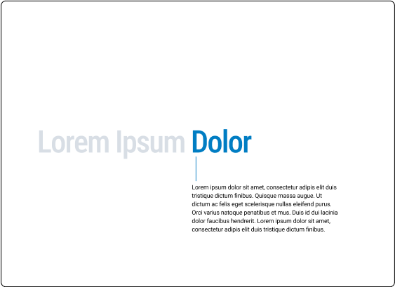
To draw emphasis to certain blocks of text we can use highlights and callout stylings. These three styles allow for different levels of emphasis.


Highlights
Highlights and Callouts
Typography
Callouts
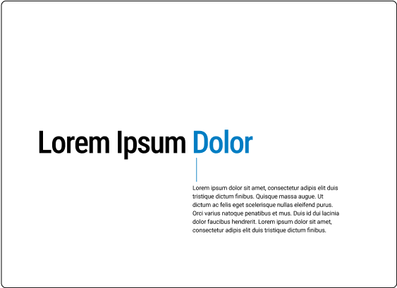
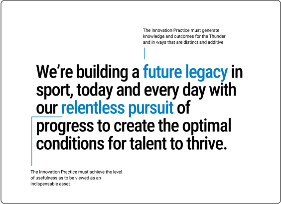
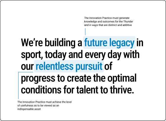
Single Line Highlight
Multiline Highlight
Single Line Callout
Multiline Callout
Multiline Highlight
Less emphasis
More emphasis
Less emphasis
More emphasis
11
OKC Slide Design Principles
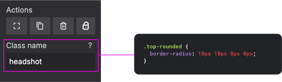
Slides.com uses web based editing styles which are controlled using HTML and CSS. The following shows you how to access those styles within slides.com.
Selecting Type to edit
Slides.com
Typography
Editing Html
Note: For simplicity some size variations are omitted from the slides waterfall. It is easier to scale up or down the type as needed for larger/smaller text needs.
Available Classes
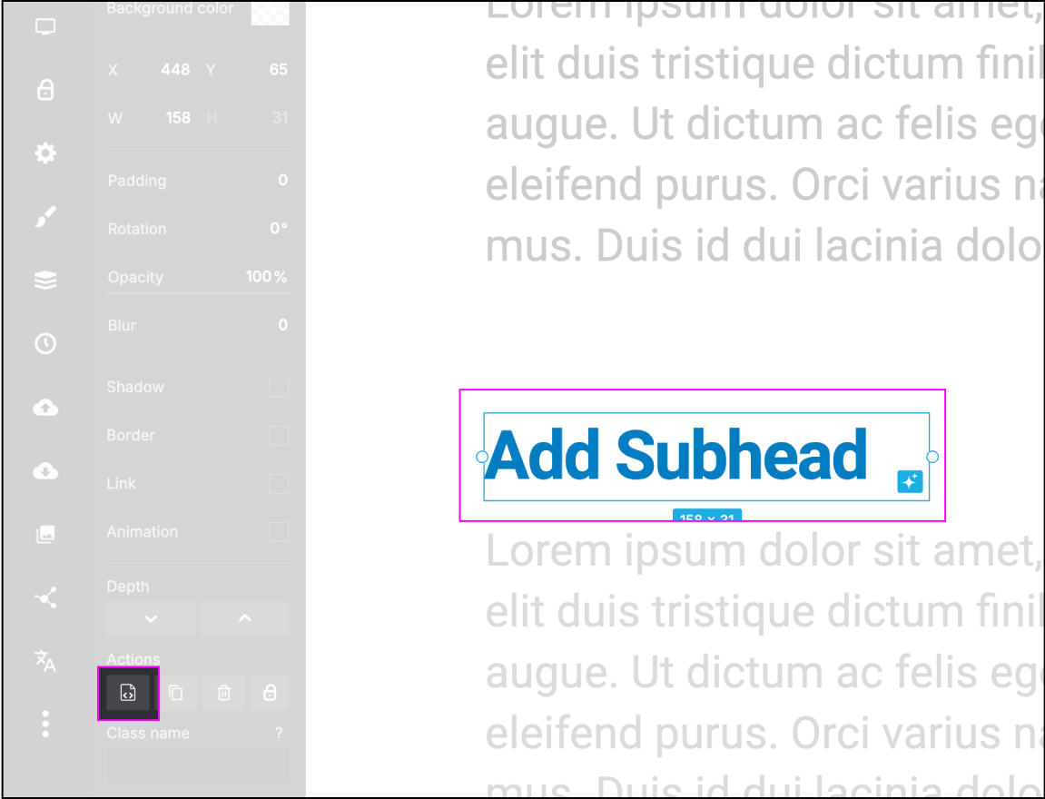
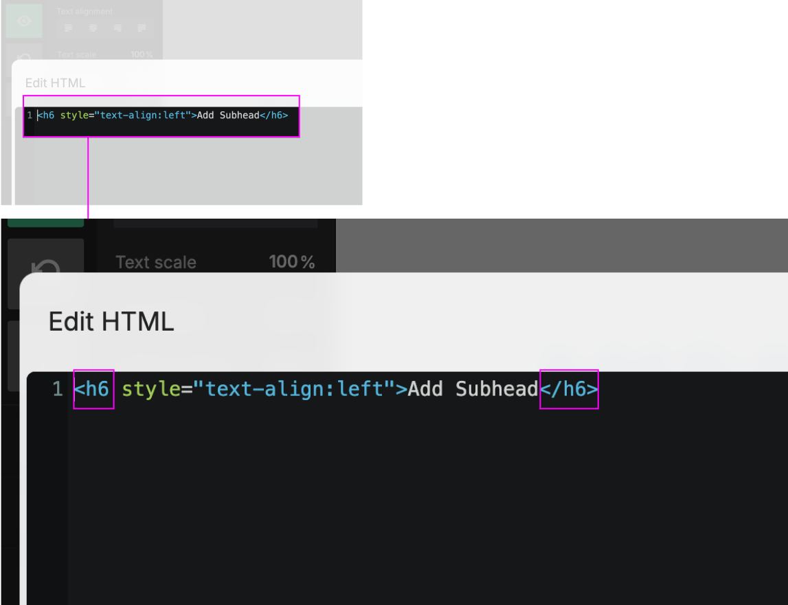
Step 1: Select type to edit
Step 2: Select the HTML edit icon highlighted above
Step 3: Edit the type by selecting the class (the value between the “<___” and “</___>”)
Step 4: When editing the class be sure not to add any additional characters or delete any existing characters
Note: Viable classes include h1, h2, h3, h4, h5, h6, h7, h8, and p
Step 5: Use the additional text editing tools featured in slides.com when specific adjustments need to be made to typography.
12
OKC Slide Design Principles
Do's and Don't's
Typography

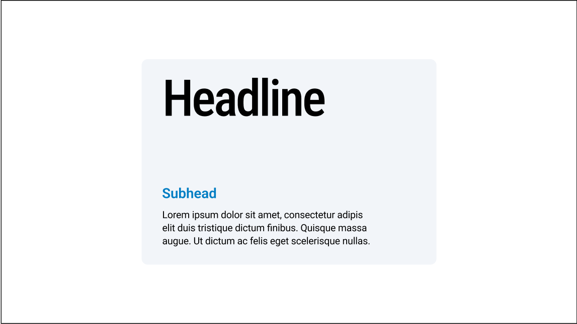
Do use type styles to create clear hierarchy
Don’t make all type a similar size
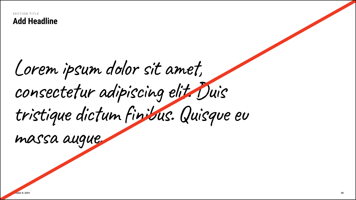
Don’t use handwritten styles for regular copy or paragraph styles
Do use handwritten styles to add emphasis to certain points
Do use color sparingly to draw attention to subheads/important details
Don’t use color unintentionally or for decorative purposes
Color
02
13
OKC Slide Design Principles
14
OKC Slide Design Principles
Color
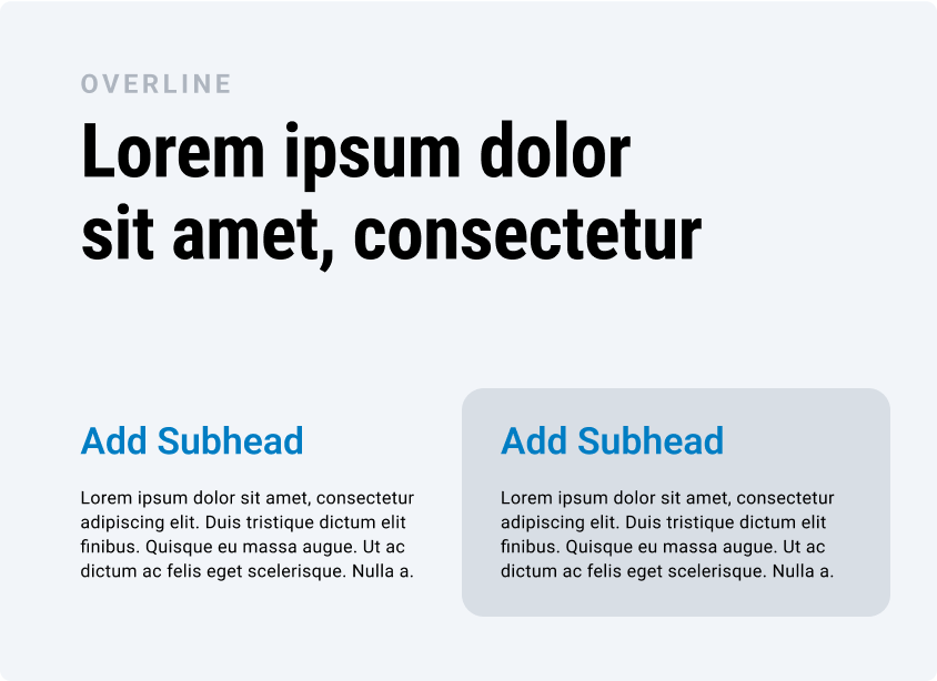
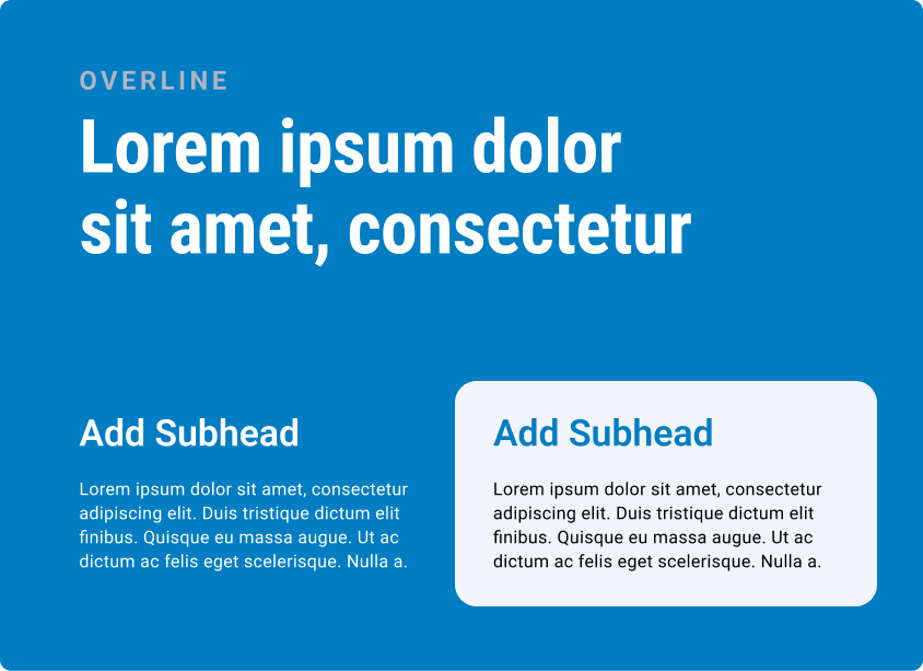
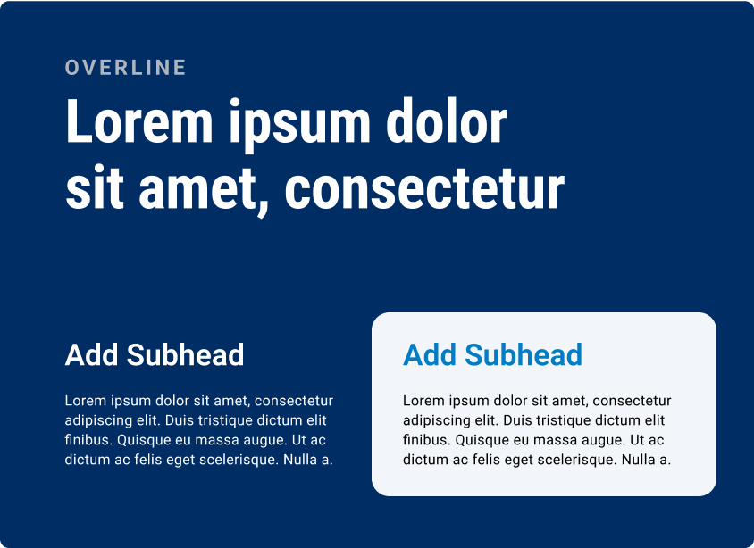
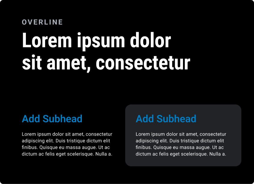
Color Palette
The color palette consists of a primary palette, grayscale palette, and data vis palette.
White
HEX: #ffffff
RGB: 0 0 0
White
HEX: #ffffff
RGB: 0 0 0
White
HEX: #ffffff
RGB: 0 0 0
White
HEX: #ffffff
RGB: 0 0 0
White
HEX: #ffffff
RGB: 0 0 0
Black
HEX: #000000
RGB: 255 255 255
Thunder Navy
HEX: #002D62
RGB: 253 187 48
Thunder Blue
HEX: #007AC1
RGB: 0 125 195
Thunder Yellow
HEX: #FDBC30
RGB: 253 187 48
Thunder Sunset
HEX: #EF3A23
RGB: 239 59 36
Gray 01
HEX: #F2F5F9
RGB: 242 245 249
Gray 02
HEX: #D8DEE5
RGB: 216 222 229
Gray 03
HEX: #AEB5BF
RGB: 174 181 191
Gray 04
HEX: #707780
RGB: 112 119 128
Gray 05
HEX: #383B40
RGB: 56 59 64
Gray 06
HEX: #212326
RGB: 33 35 38
Gray 06
HEX: #212326
RGB: 33 35 38
Black
HEX: #000000
RGB: 255 255 255
Red 01
HEX: #FFDDD9
RGB: 255 221 217
Red 02
HEX: #FFB0A6
RGB: 255 176 166
Red 03
HEX: #FF8E80
RGB: 255 142 128
Red 04 /
Thunder Sunset
HEX: #EF3A23
RGB: 239 58 35
Red 05
HEX: #CC1700
RGB: 204 23 0
Green 01
HEX: #CDF9E6
RGB: 205 249 230
Green 02
HEX: #A9EACD
RGB: 169 234 205
Green 03
HEX: #74DCAE
RGB: 116 220 174
Green 04
HEX: #2CC378
RGB: 44 195 120
Green 05
HEX: #009954
RGB: 0 153 84
15
OKC Slide Design Principles
Color
Color Pairings
The following are best practice color pairings for typography and slides.
Primary Pairings
Secondary Pairings
Grayscale Pairings
DARK MODE Pairings
16
OKC Slide Design Principles
Do's and Don't's
Typography

Do use flood colors to differentiate title slides and dividers
Don’t create dividers slides that are too similar to content slides
Don’t use unapproved module colors
Do use colors that lightly distinguish modules from the background
Do use color sparingly to draw attention to subheads/important details
Don’t use color unintentionally or for decorative purposes
Layout & Construction
03
17
OKC Slide Design Principles
18
OKC Slide Design Principles
Layout & Construction
Color Pairings
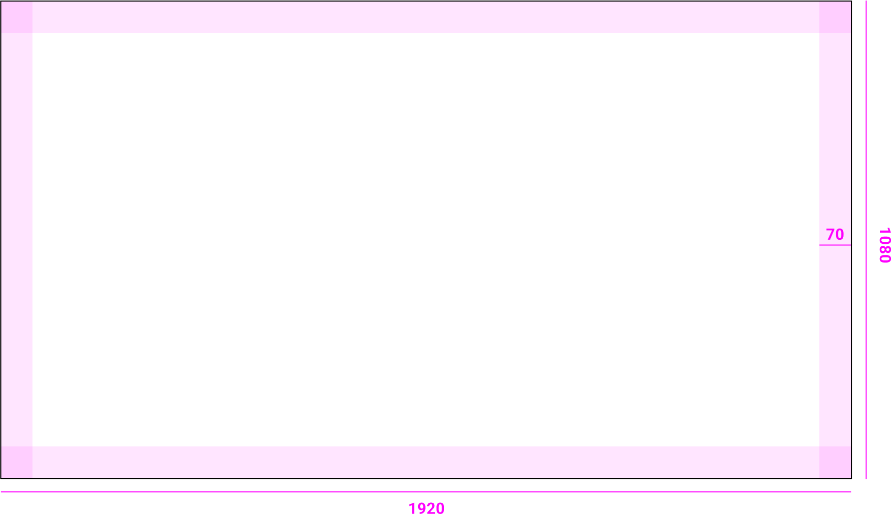
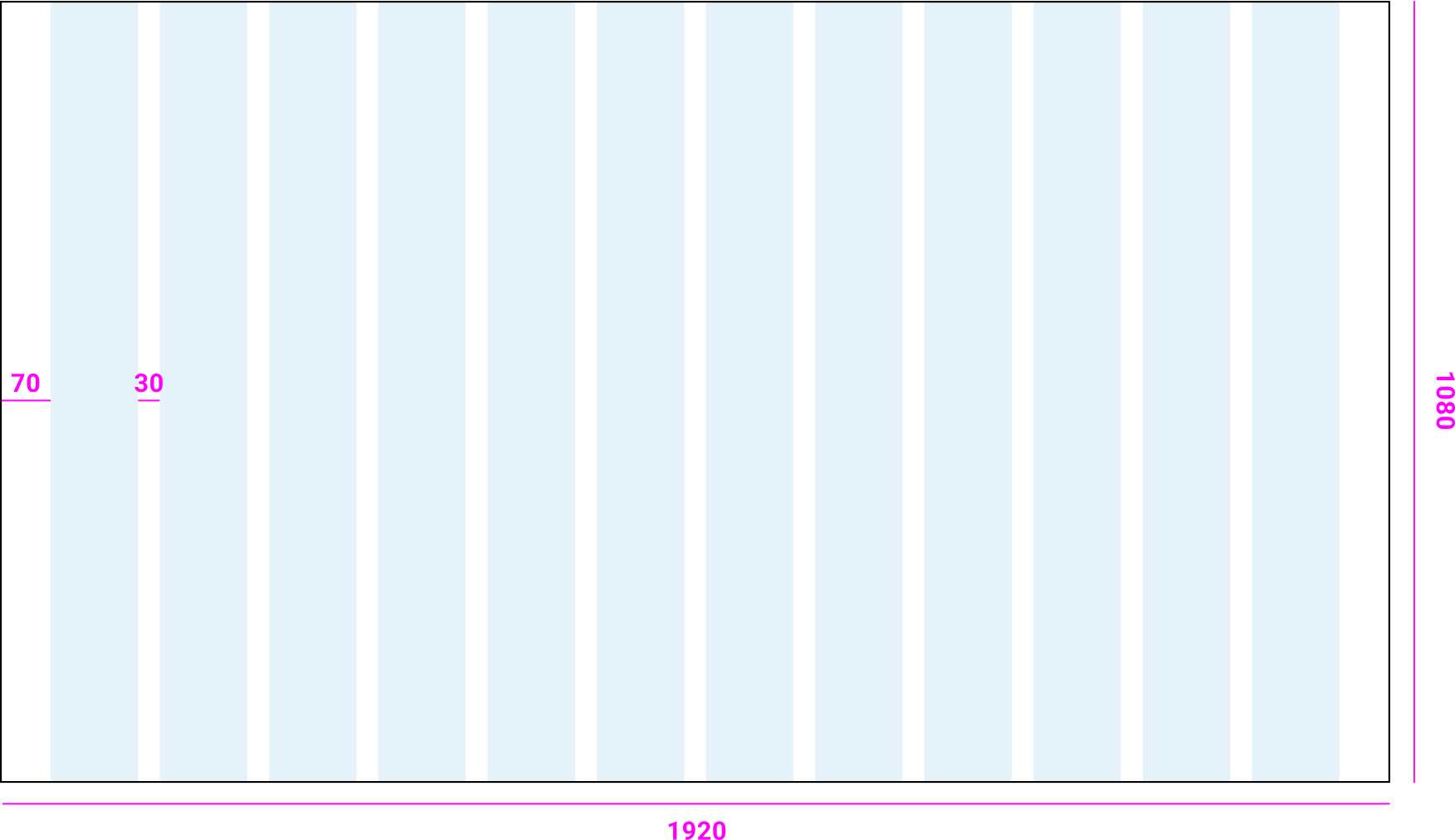
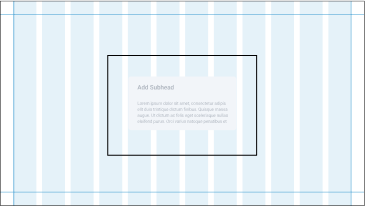
The following is an example of the values of the 12 column grid we use for 1920x1080 presentations.
Margins
12 column Grid
19
OKC Slide Design Principles
Layout & Construction
Wayfinding
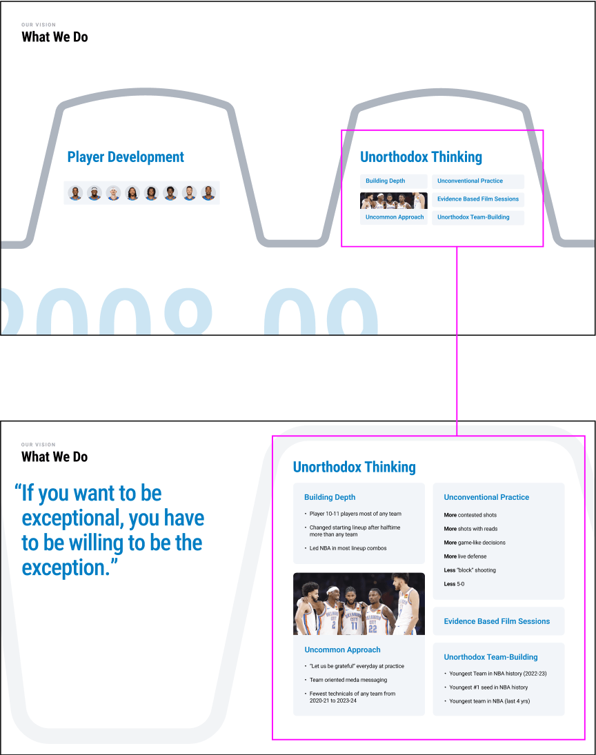
Wayfinding exampleBy keeping way finding consistent we can follow narratives through multiple slides and animations while keeping the slides grounded in the main takeaway of the section.
The way finding should always be in the same location with consistent information across every slide.
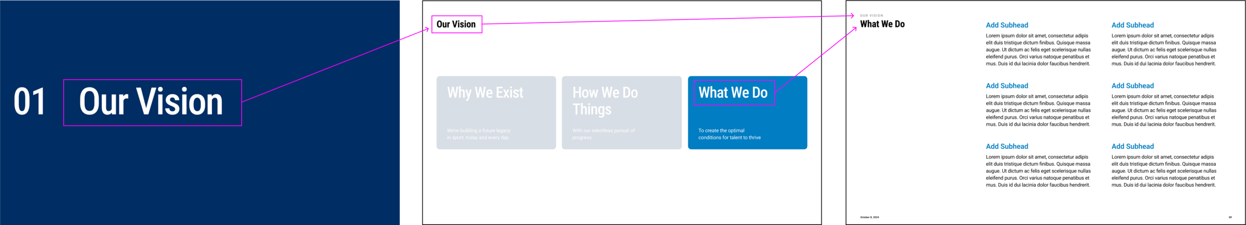
Section Title
Subsection / Chapter Slide
Content Slide
20
OKC Slide Design Principles
Layout & Construction
Layout Variation
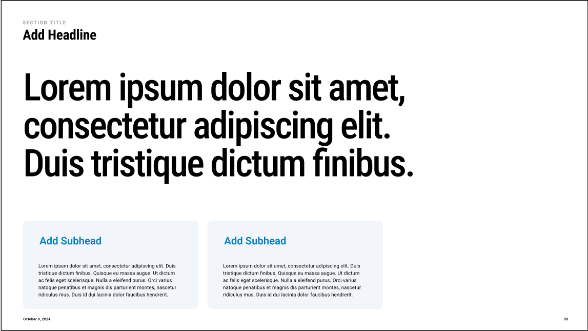
Slide templates should be used as a starting point for presentations, not rigid guidelines.
In instances where the content needs don’t suit a specific template, use the tools in the design system to modify or restructure templates.
Base Templates
Template variations
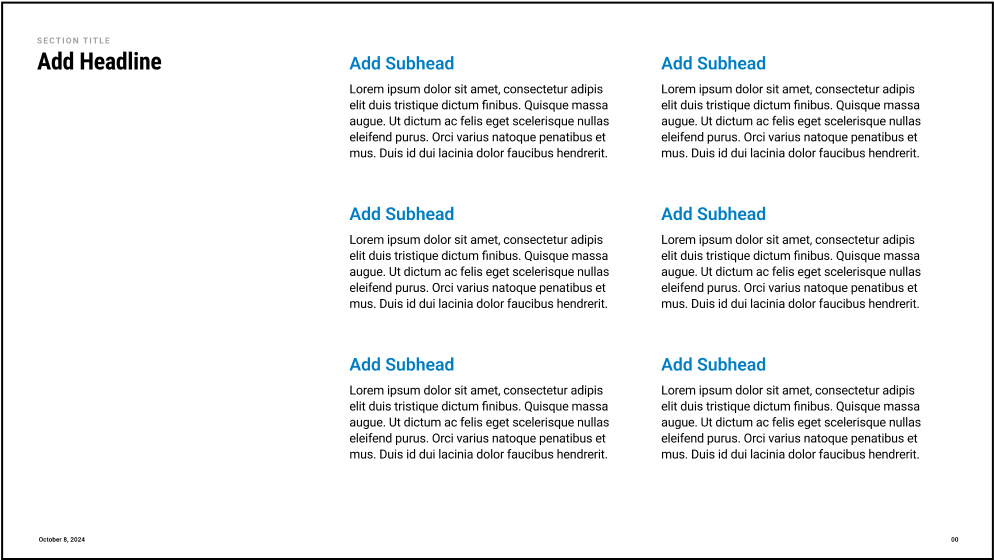
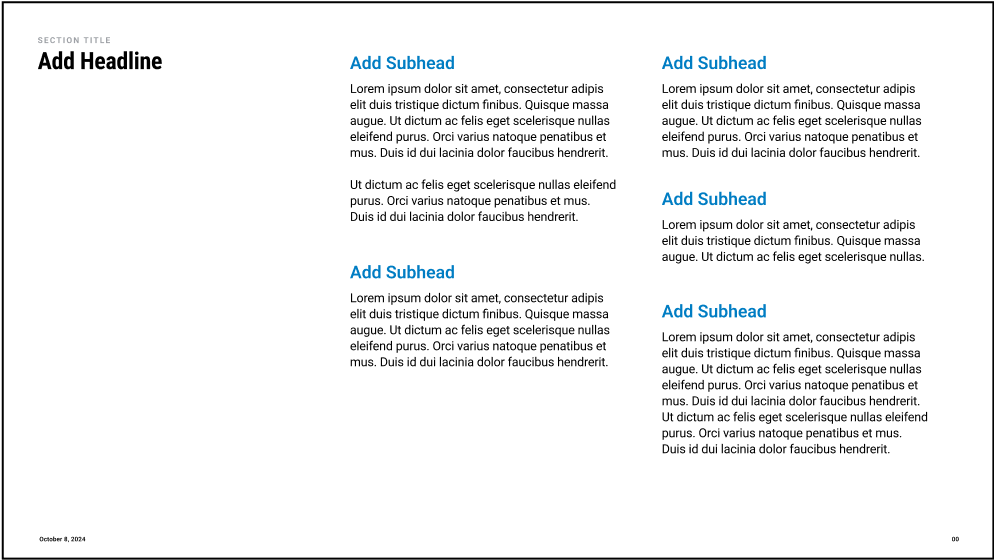
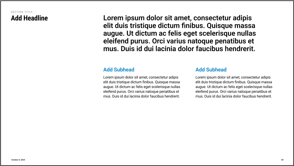
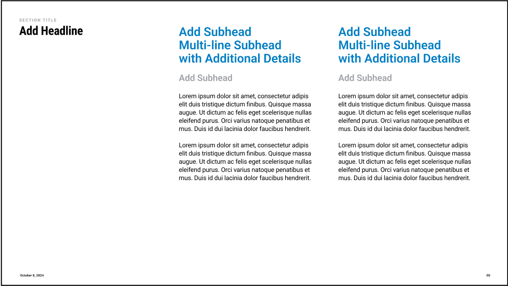
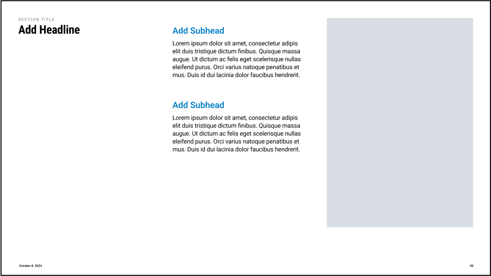
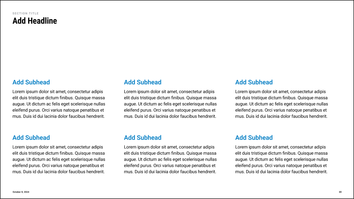
6 Subhead Template
5 Subheads | Uneven Length
Large Copy & 2 Subheads
2 Column More Complex Subheads
2 Subheads & Image
21
OKC Slide Design Principles
Layout & Construction
Layout Variation
Slide templates should be used as a starting point for presentations, not rigid guidelines.
In instances where the content needs don’t suit a specific template, use the tools in the design system to modify or restructure templates.
Base Templates
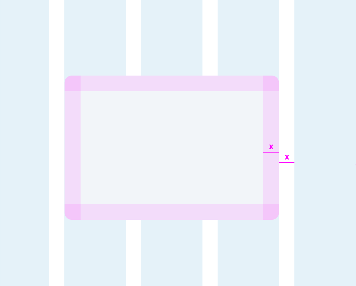
Template variations
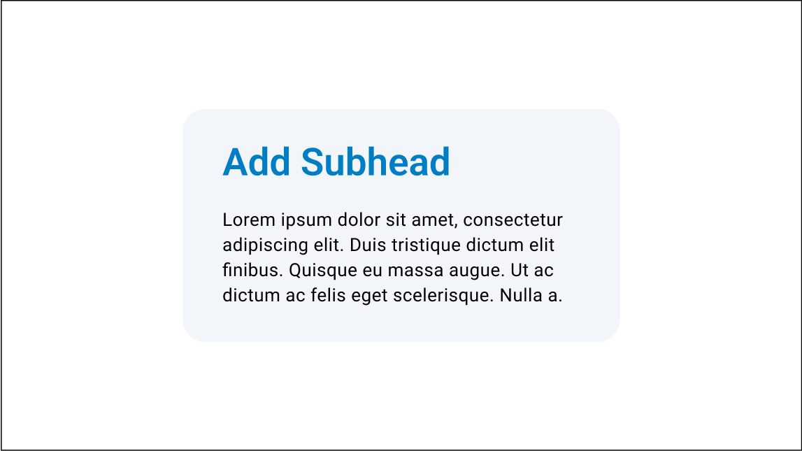
Modules should be placed within the 12 column grid.The module padding is equal to the column grid gutters. (On a 1920x1080 page x=30px)
Template variations
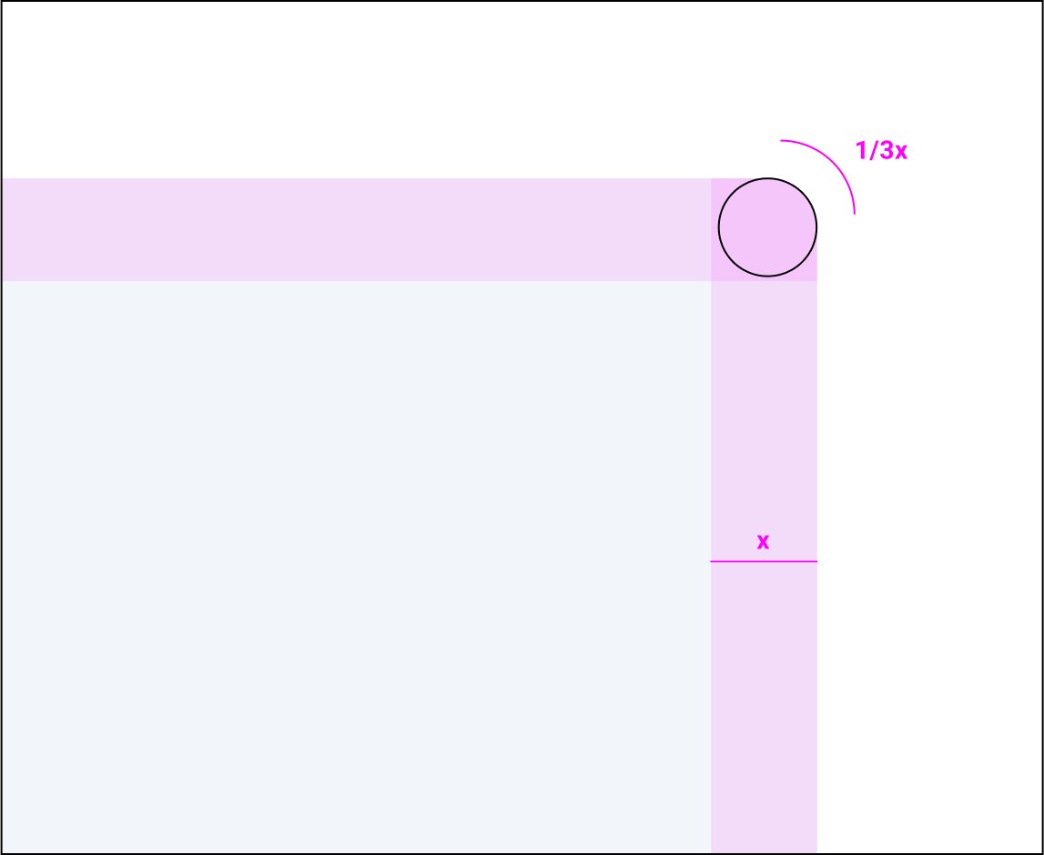
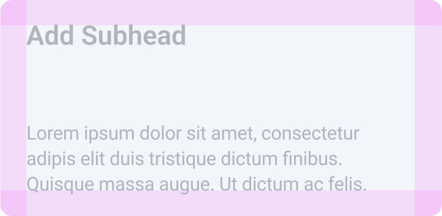

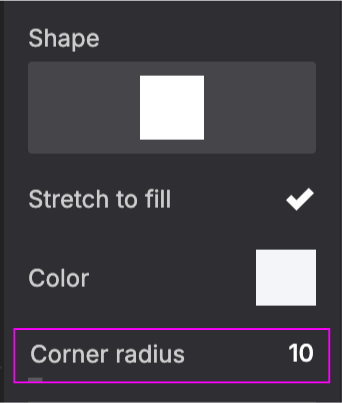
The corner roundness of the modules is equal to 1/3 the padding value. (On a 1920x1080 page 1/3x=10px).
Note: Different softwares have different corner rounding values and measurements. When creating new modules try and match template modules
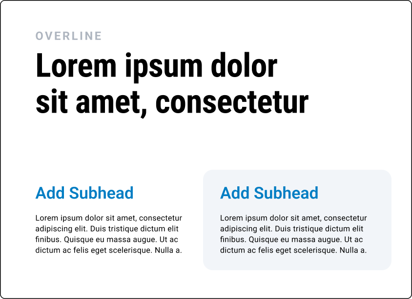
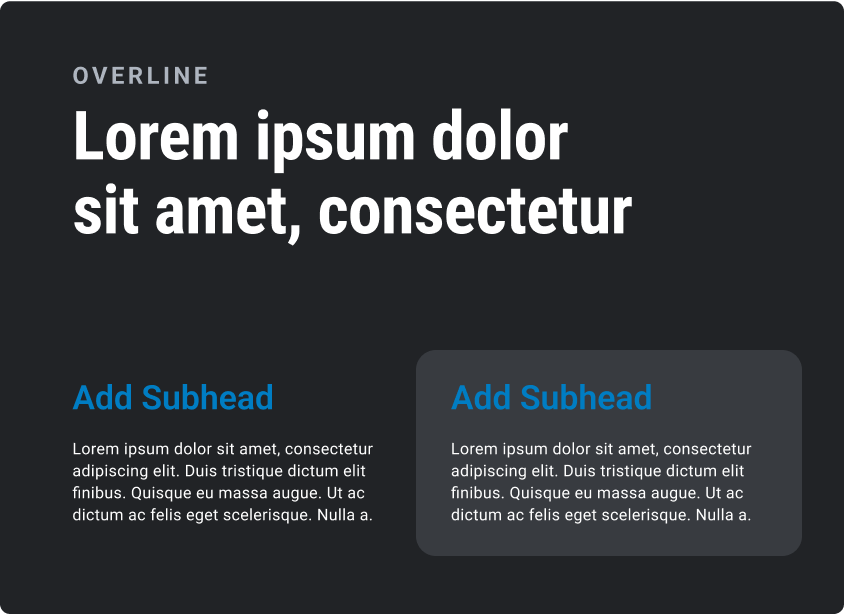
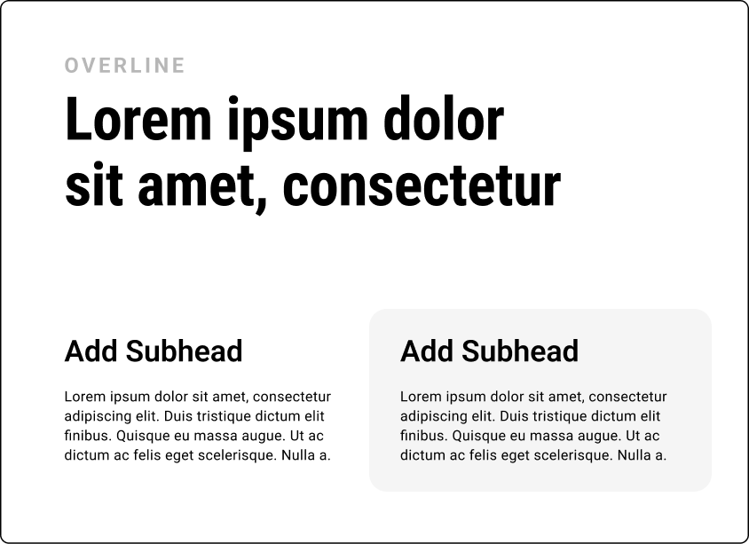
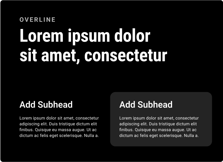
When placing content within a module it is important to keep in mind the general rules of type hierarchy and composition.

Content ligned to the module
Module aligned to the content
22
OKC Slide Design Principles
Layout & Construction
Module Specs
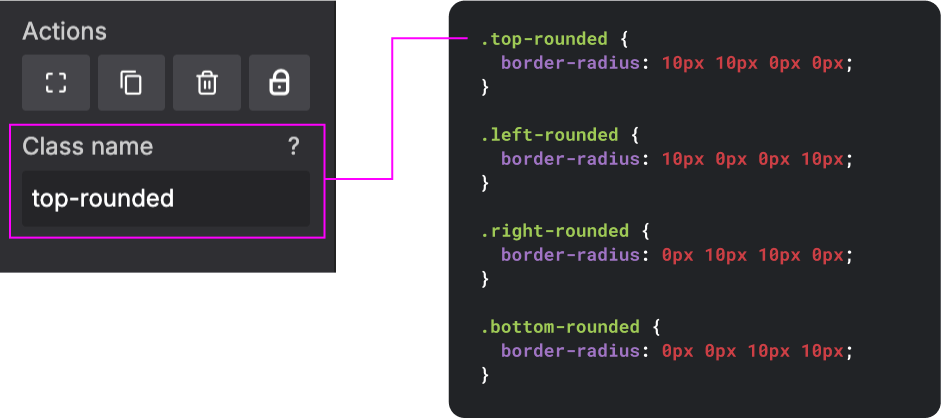
By using shape controllers and custom CSS within slides.com, we can construct modules with consistent rounding and styling.
Base Templates
Template variations
Template variations


SLIDES.COM
SLIDES.COM
CUSTOM CSS
SLIDES.COM
CUSTOM CSS
23
OKC Slide Design Principles
Layout & Construction
Module Examples
Slide templates should be used as a starting point for presentations, not rigid guidelines.
In instances where the content needs don’t suit a specific template, use the tools in the design system to modify or restructure templates.
TYPE MODULES
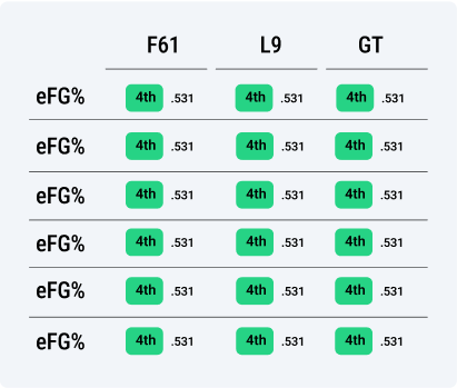
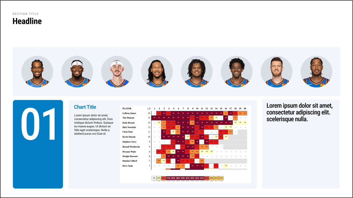
Data Modules
PLAYER MODULES


24
OKC Slide Design Principles
Layout & Construction
Module Examples
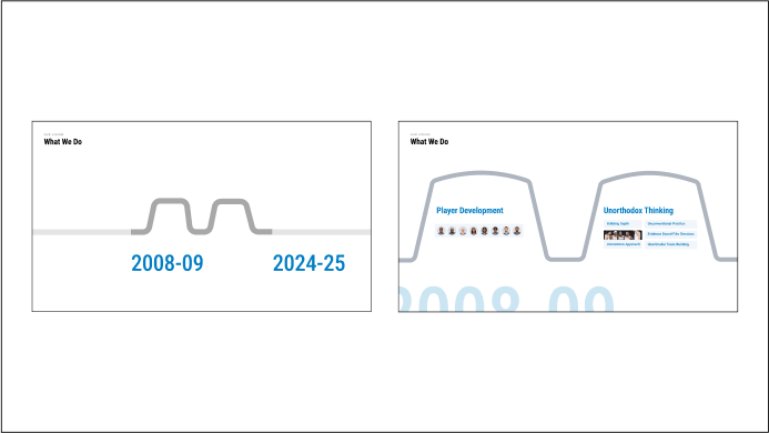
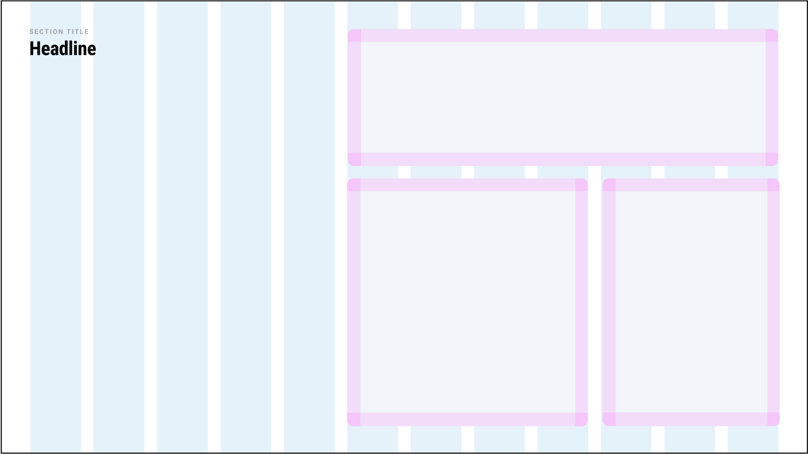
Modules can be expanded or contracted to accommodate any amount of information.
INFORMATION VOLUME
IN USE

LESS INFORMATION
MORE INFORMATON
Collapsed
Expanded
25
OKC Slide Design Principles
Layout & Construction
Module Combinations
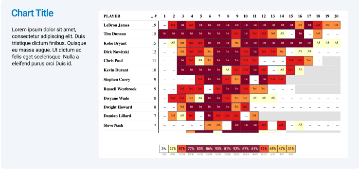
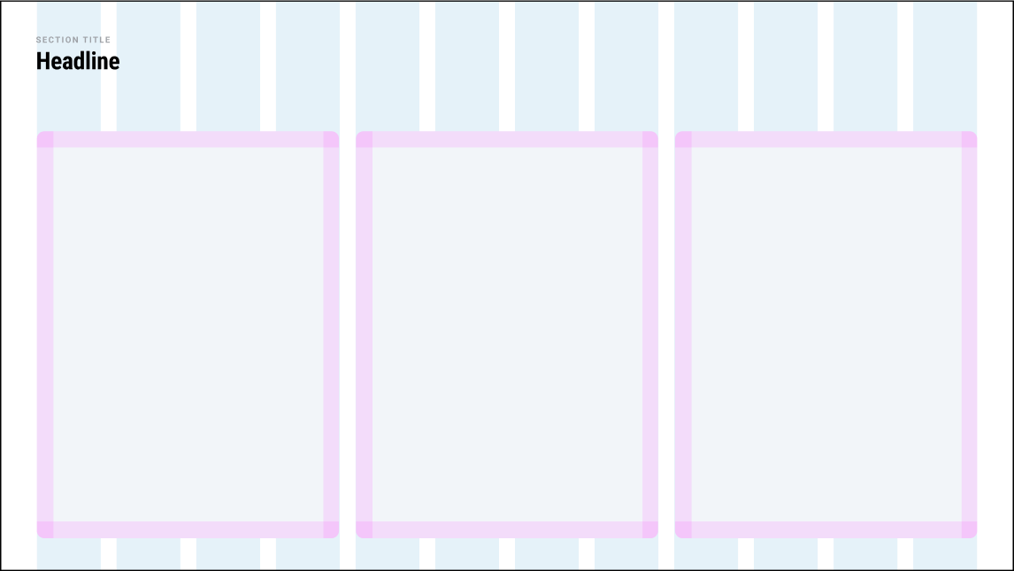
Multiple modules can be combined to show a dense overview of information in an organized and consistent way.
Examples

26
OKC Slide Design Principles
Layout & Construction
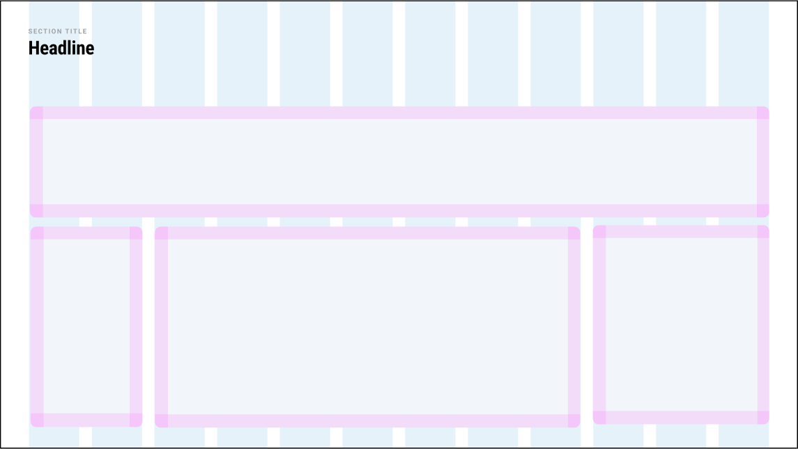
Dynamic Transitions
Multiple modules can be combined to show a dense overview of information in an organized and consistent way.
Examples


27
OKC Slide Design Principles
Do's and Don't's
Typography

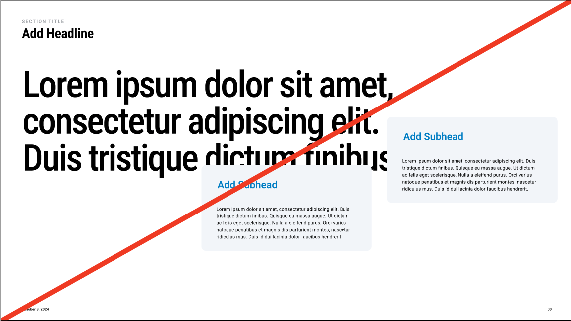

Do place modules neatly into the page layout
Don’t place modules over other elements on the page
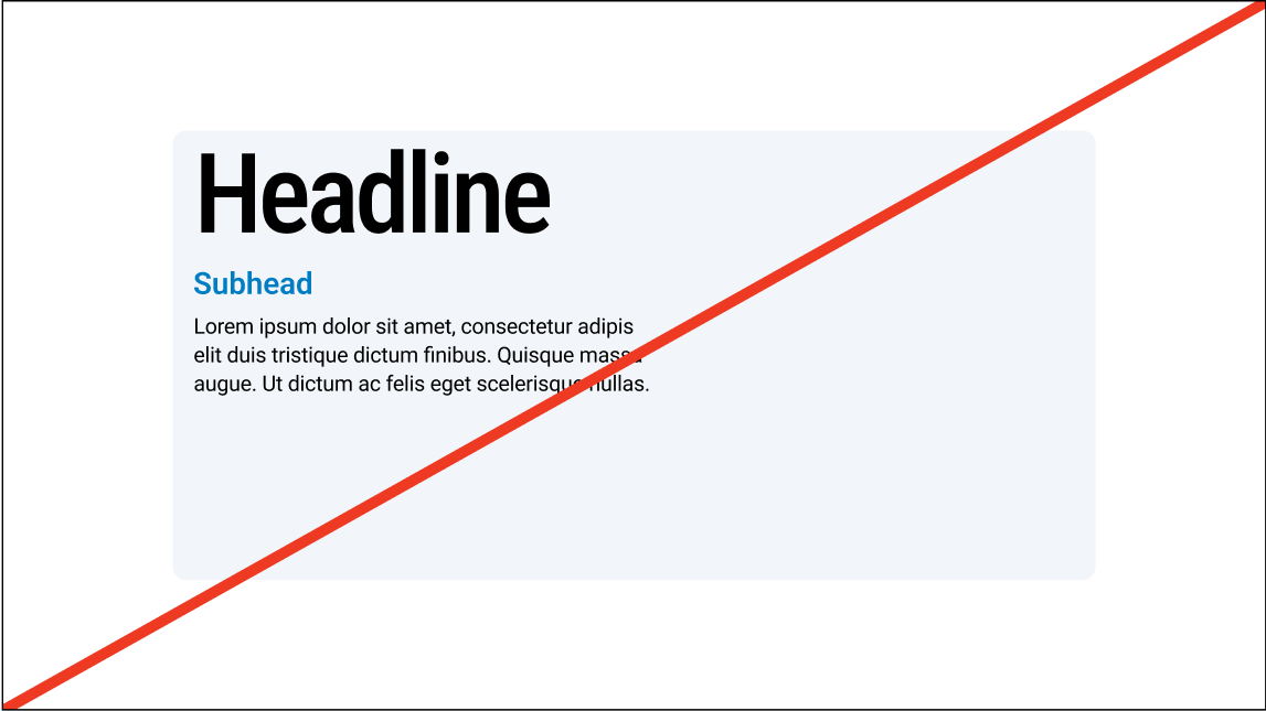
Don’t create module corners that are too sharp/too round
Do use consistent corner rounding on modules
Do distribute elements within the module
Don’t bunch content together or overcrowd the module
Photography
04
28
OKC Slide Design Principles
29
OKC Slide Design Principles
PhotographyPhoto Editing
When setting type over imagery we always use white type. Images should be selected so that type can be overlaid while remaining legible and clear.
In instances where type needs to be overlaid on images that are too busy, or don’t provide enough contrast, we can use an image overlay or use modules.
No Editing
IMage Overlay
Module Use


30
OKC Slide Design Principles
Do's and Don't's
Typography


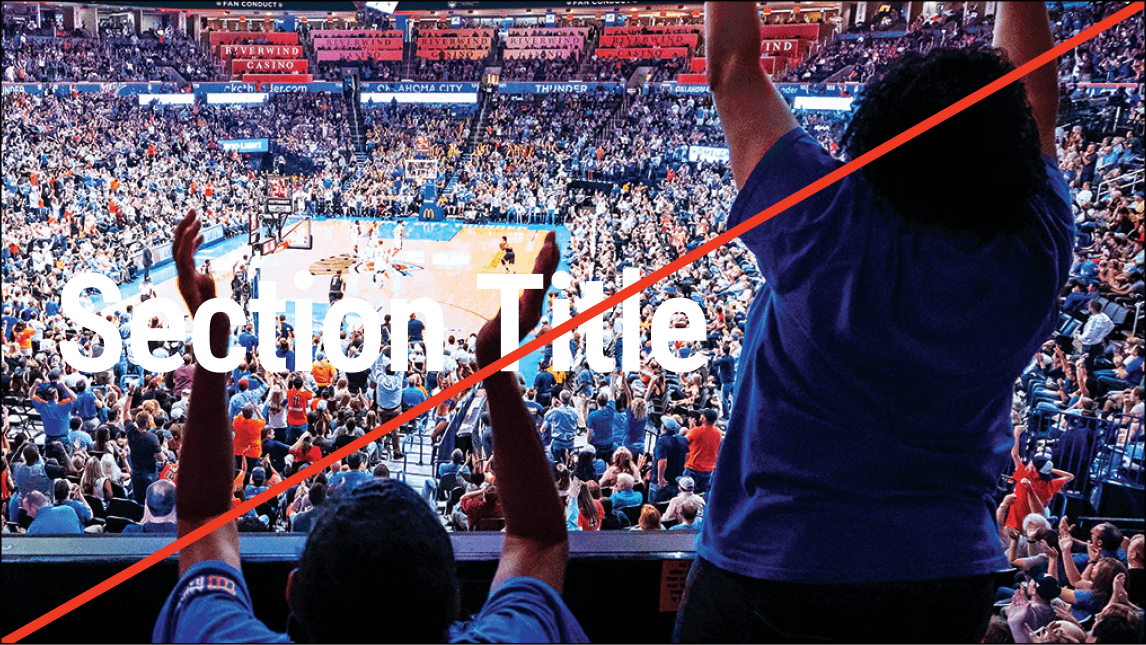


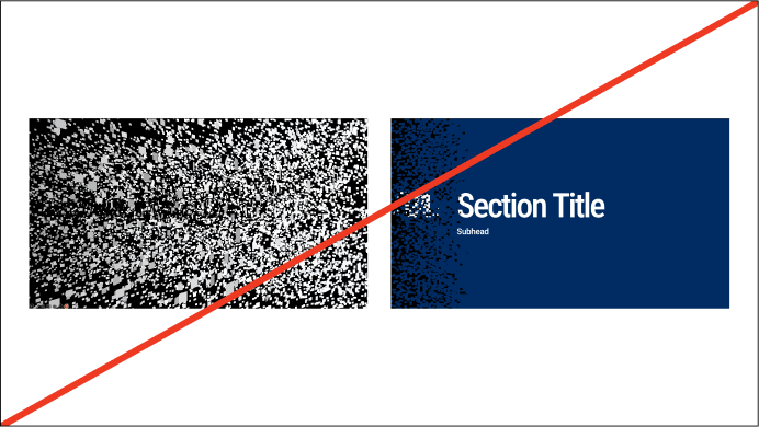
Do use type over imagery that is high contrast with clear space
Don’t use type over complex or low contrast imagery
Don’t use excessive effects on imagery
Do use imagery that is clear and lightly edited
Do use an overlay on imagery that is too light or busy
Don’t use light overlays or inverse the contrast of the type and photo
Thank you